

John Deere Logos Over the Years: The Leaping Deer From 1876 to Today
Ask anyone to draw a farm equipment logo and most will sketch a deer in mid-leap. That is how deep the John Deere trademark runs. Even so, John Deere logos over the years have changed more than most people notice. The deer has faced different ways, lost and gained a log, grown new antlers, and only recently started jumping up instead of coming down. Here is the story, drawn mainly from the company’s own trademark history.
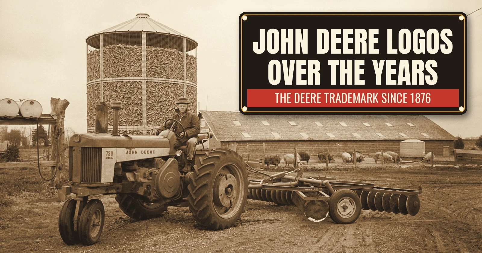
The photo at the top was taken on April 23, 1963, on a hog farm in Iowa by Warren K. Leffler for U.S. News & World Report. A farmer in a work coat sits on a John Deere 730 Diesel pulling a John Deere disc harrow. Behind him stands a round crib full of ear corn, and a row of pigs wanders along a long brick barn. You can read “JOHN DEERE” on the hood and on the harrow, which is how the name showed up on farms every day.
The plow that came before the logo
The company is older than its deer. John Deere was born on February 7, 1804, in Rutland, Vermont, and trained as a blacksmith. In 1836 he moved west to Grand Detour, Illinois. There, prairie soil stuck to the cast-iron plows farmers had brought from the East, so they had to stop and scrape them clean every few steps.
In 1837, Deere made a plow from a broken steel saw blade. Its polished surface scoured itself as it cut, and the soil slid off. As a result, demand grew quickly. In 1848 he moved his business to Moline, Illinois, on the Mississippi River, for its water power and shipping. The company was incorporated as Deere & Company in 1868, with his son Charles Deere running it.
For years, though, there was no deer on anything. The plows sold on the name and on word of mouth.
John Deere logos over the years: the first leaping deer
The first trademark arrived in 1876. According to Deere’s trademark history, the company registered a leaping deer that year, and the paperwork said the mark had already been in use for three years. In other words, the deer dates back to about 1873.
That first deer bounds over a log. By then, Deere was making more than 60,000 “Moline plows” a year, so a mark of its own made good sense. Interestingly, the species is not clear. The early animal does not look much like the white-tailed deer common in Illinois. Later versions, however, would look more and more like one.
The next version was in use by 1910 and registered in 1912. It had a lot more detail. It also carried a slogan: “The Trade Mark of Quality Made Famous by Good Implements.” Meanwhile, the company itself was changing. In 1918 Deere bought the Waterloo Gasoline Engine Company, maker of the Waterloo Boy tractor. Then, in 1923, the John Deere Model D arrived, and the company was firmly in the tractor business.
John Deere logos over the years go solid
By the 1930s, the detailed deer had a practical problem. It was hard to paint. In 1936, a company standardization committee wanted a mark better adapted “for stenciling on products,” as Deere’s history puts it.
So the deer became a solid silhouette. A 12-sided border went around it, and the words “John Deere, Moline, Ill.” became bolder. Just one year later, in 1937, the company celebrated its 100th year. For the centennial, the border was dropped.
That change says a lot about how logos worked then. A company mark had to survive a can of paint, a stencil and a farmer’s hard use, not just a printing press. Simple shapes won.
Antlers forward, tail up
The version that many people call the 1950 logo first appeared in 1940. It looked noticeably different. For example, the antlers turned forward, and the tail went up the way a white-tail raises its flag when it runs. The log disappeared too.
The type changed as well. “John Deere” now sat above the deer in a bold square-serif face. The slogan became “Quality Farm Equipment,” and “Moline, Ill.” was dropped. A four-sided border framed the whole thing.
Those were busy years. During World War II, Deere built military tractors and M3 tank transmissions alongside farm equipment. After the war, the company kept growing, and in 1956 it bought the German tractor maker Lanz.
John Deere logos over the years: a name below the deer
The next version appeared in 1956 and was registered in 1962. It dropped the slogan entirely. In addition, for the first time, “John Deere” sat below the deer instead of above it.
That move fit a company that now made more than farm machines. By the mid-1950s, Deere was in the construction equipment business, with machines painted yellow and black instead of the green and yellow used in the fields. As a result, a mark that simply said “John Deere” worked better than one that talked about farm equipment.
The tractor in our 1963 photo comes from the end of an era. The 730 Diesel was introduced in August 1958, as part of Deere’s 30 Series, and it was among the last of the company’s famous two-cylinder tractors. Domestic production ended in June 1960. Soon afterward, Deere unveiled its “New Generation” four- and six-cylinder tractors, such as the 4010.
The 1968 deer and the 2000 update
In 1968, the logo got its most modern look so far. A company memo said the change was “in keeping with the progress being made throughout all divisions of the Company,” and it promised “better reproduction and greater readability.”
The new deer was a straight-sided silhouette. It showed only two legs and one four-point rack of antlers. The lettering was a hand-modified version of Helvetica, the clean typeface that was everywhere in the late 1960s. Meanwhile, the oval was narrowed and the deer was enlarged to fill more of it.
The latest update on Deere’s trademark timeline came in 2000. The antlers got sharper, and the body got more muscle. Most importantly, for the first time the deer is leaping upward rather than landing. Deere also says the leaping deer is the longest continuously used corporate logo of any Fortune 500 company. After about 150 years, that is easy to believe.
Even the slogan has a long life. “Nothing Runs Like a Deere” has become as well known as the deer itself. The company is still based in Moline, and its stock trades under the ticker DE.
John Deere logos over the years on porcelain signs
Implement dealers, feed stores and repair shops hung porcelain advertising signs for the same reason Deere simplified its deer. A sign had to be easy to read at a distance and tough enough to survive weather. Glass fired onto steel kept its color for decades. That is still the big difference between porcelain and tin signs.
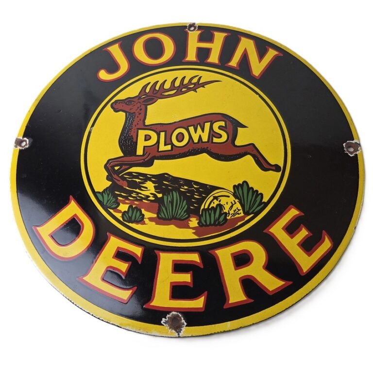
Our vintage porcelain signs include several John Deere designs that echo the logo story. For instance, the John Deere Plows leaping deer porcelain sign shows the deer in yellow and black on a 12 inch round. It is glossy on both sides.
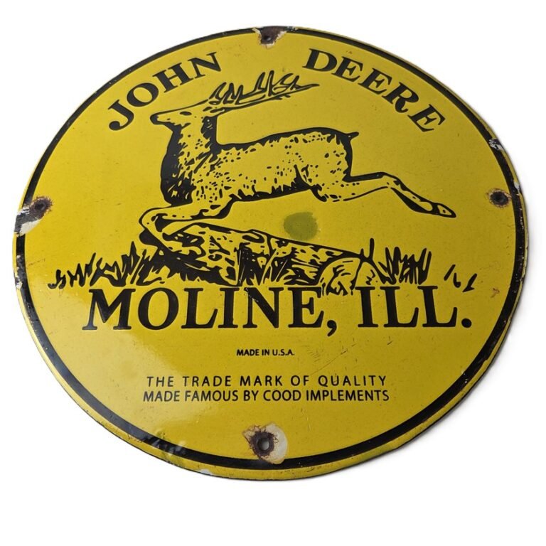
Similarly, the John Deere Moline, Ill. leaping deer porcelain sign puts the trademark and the Moline name on bright yellow. That is a nice nod to the years when the city appeared under the deer.
More porcelain signs for the barn and shop
There is more for a farm wall. The John Deere Farm Implements porcelain sign is a long black sign, 17 3/4 by 8 1/4 inches. The John Deere Moline deer head sign shows a yellow deer head on green, and the John Deere pin-up sign adds a farm girl, a green tractor and a red barn. To see everything, browse our farming and tractor signs, cabin and lodge signs and man cave signs. When you are ready to hang one, our guide on how to hang porcelain signs covers drywall, brick and garage studs.
We ship from Houston, Texas. US orders ship for a flat $10, and international shipping is available at checkout. If a sign is not right, you have 30 days to return it. We pay the return shipping, and you get a full refund.
John Deere, the leaping deer trademark and “Nothing Runs Like a Deere” are trademarks of Deere & Company. This article is history and commentary only. We sell porcelain advertising signs that celebrate these brands, and we are not affiliated with Deere & Company or any other company named here.
FAQ: John Deere logos over the years
When did John Deere first use the leaping deer?
Deere registered its first leaping deer trademark in 1876, and the filing said the mark had already been in use for three years, so since about 1873.
Why does the John Deere deer face different ways in old logos?
The deer was redrawn several times. The 1936 version became a solid silhouette for stenciling, the 1950 version turned the antlers forward and raised the tail, and the 1968 version simplified it to two legs and one rack of antlers.
When did the deer start leaping upward?
In the 2000 update. Earlier deer were shown landing, while the current one jumps upward with sharper antlers.
What font is in the John Deere logo?
According to Deere, the 1968 logotype was a hand-modified version of Helvetica.
The featured photo is “[Man driving a John Deere tractor, pigs and corn crib in the background, Iowa],” by Warren K. Leffler, April 1963, U.S. News & World Report Magazine Photograph Collection, Library of Congress, with no known restrictions on publication. You can see the full photo at the Library of Congress.

Add a review
Your email address will not be published. Required fields are marked *