
Harley-Davidson Logo History: The Bar & Shield Through the Years
Few company marks are tattooed on as many arms as the Harley-Davidson Bar & Shield. Riders know it on sight, and so do people who have never sat on a motorcycle. Yet the Harley-Davidson logo history has a few surprises. Nobody knows who drew the first one, the company dropped it for more than a decade, and the version on today’s bikes was used only twice before 1976. Here is the story, using the company’s own archives as the main source.
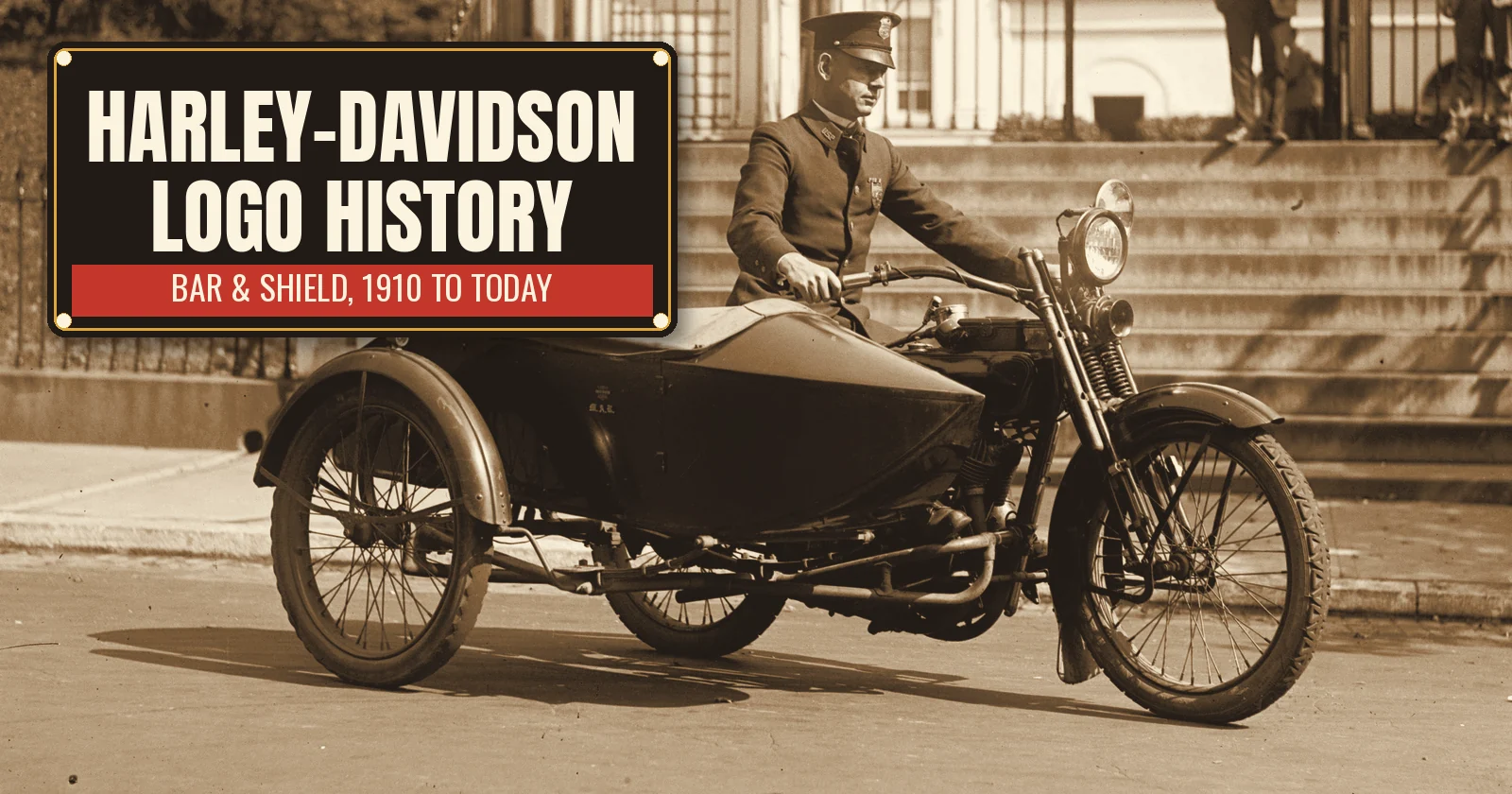
The photo at the top was taken in 1922 by the National Photo Company in Washington, D.C. A police sergeant named Rainey sits on a Harley-Davidson with a sidecar, parked at the foot of a set of stone steps. Wikimedia Commons identifies him as Sergeant Maurice A. Rainey of the U.S. Park Police and the machine as a J-series V-twin. Police departments across the country bought motorcycles like this one in the 1920s, and that is a big part of how the name got in front of the public.
Harley-Davidson logo history begins in a backyard shed
The company started small. In 1903, William S. Harley and Arthur Davidson built their first motorcycle in a 10 by 15 foot wooden shed in Milwaukee. Arthur’s brothers Walter and William A. Davidson soon joined them. In 1906 they moved into their first factory on Chestnut Street, which later became Juneau Avenue, and the company was incorporated in September 1907.
At first there was no Bar & Shield at all. Early ads called the 1906 machine the “Silent Gray Fellow,” a nod to its quiet muffler and gray paint. In other words, the young company sold itself on reliability, not on a symbol.
Who designed the Bar & Shield?
This is the first surprise. According to the Harley-Davidson Archives, there are no records that show who designed the logo or what inspired it. Some fans credit one founder or another. However, the archives do not back any of those stories, so it is best to treat them as legend.
What the archives do have are dates. A trademark application filed on January 30, 1930, states that the Bar & Shield had been “continuously used” since May 6, 1910. The company also made a trademark application on July 19, 1910. The earliest item in the archives that shows the logo is the back cover of the 1910 motorcycle catalog. Meanwhile, wet-transfer decals for toolboxes and frame necks carried part numbers that date back to 1908, which hints that some form of branding was on the machines even earlier.
You will see other dates online. For example, a few websites say the logo was trademarked in 1911. We follow the company’s own account here, since it comes straight from the trademark filings.
Orange and black: Harley-Davidson logo history in color
The colors came later than the shape. The archives say black and orange were first tied to the logo around 1922, when they showed up on parts and accessories packaging. Harley’s oil cans from that era, for instance, were orange with black lettering. After that, the pairing stuck.
Meanwhile, the company grew fast. By 1920 Harley-Davidson was the largest motorcycle maker in the world, with dealers in 67 countries. The teardrop gas tank arrived in 1925, and the Knucklehead engine followed in 1936. During World War II, Harley built about 90,000 military motorcycles, most of them the WLA model. Each of those machines and dealer signs helped spread the Bar & Shield.
For most of these decades, the logo looked a little different from the one on bikes today. According to the H-D Museum, the main version used from 1910 to 1964 had a thinner shield drawn with straighter lines. Therefore, if you see an old dealer photo, look closely at the shape. It is not quite the one on a modern tank.
The diamond logo years
Here is the second surprise. In 1964, Harley replaced the classic Bar & Shield with a simplified mark that collectors call the “diamond logo.” It was cleaner and easier to print. The 1963 model year was the first time it appeared on gas tanks.
The reason was practical. In those years, Harley-Davidson sold far more than motorcycles. It was a leader in golf cars, so the company wanted a mark that could live on many kinds of products. As a result, the Bar & Shield went quiet for more than ten years.
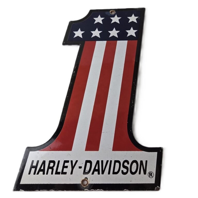
Then in 1969, the American Machine and Foundry company, better known as AMF, bought Harley-Davidson. That same year the company made the Number One logo its main trademark. The H-D Museum says it was inspired by the American flag and by Mert Lawill’s Grand National Championship season.
Harley-Davidson logo history and the 1976 comeback
The modern Bar & Shield came back because of the Bicentennial. In 1975, Willie G. Davidson, the company’s head designer and a grandson of a founder, wrote a memo to dealers. America was about to turn 200, and he wanted something special for the coming models. So he proposed three design elements: an eagle, the old Bar & Shield, and the Number One logo.
However, Willie G. did not choose the thin shield used from 1910 to 1964. Instead, he reached for a rarer version. To the knowledge of the Harley-Davidson Archives, that version had been used only twice before 1976, once on a 1917 flyer and again on a monogram patch sold in 1931 and 1932. Willie G. hired a Milwaukee artist named Paul Smith to combine it with the eagle. The first gas tank to wear the present logo was the 1977 XLCR Café Racer.
That shield is the one most people picture today. In short, the company brought back a deep cut, and the deep cut became the standard.
The eagle soars alone
The eagle took on even more meaning a few years later. In 1981, a group of 13 executives, including Willie G. and Vaughn Beals, bought the company back from AMF for about $80 million. Their rallying cry was “The Eagle Soars Alone.”
Two years later, in 1983, the company formed the Harley Owners Group, or H.O.G. The name nods to the “hog boys,” a 1920 racing team that carried a live pig as a mascot on victory laps. Both H.O.G. and the Screamin’ Eagle performance parts line put the eagle front and center. In 2006 the company even changed its New York Stock Exchange ticker symbol to HOG. Two years after that, the Harley-Davidson Museum opened in Milwaukee in 2008.
In the 2000s, Harley also began using a version of the shield with no lettering at all. Riders still know it immediately, which says a lot about a century of repetition.
Harley-Davidson logo history on porcelain signs
Porcelain enamel and motorcycles grew up together. Glass fired onto steel held its color through sun, rain and grease, so dealers and repair shops hung porcelain advertising signs out front for decades. That is why so many bikers want one in the garage today. Porcelain also outlasts printed metal by a wide margin, as our guide to porcelain vs tin signs explains. And if you are shopping for a rider, our gifts for car guys list has a section just for Harley fans.
We carry several Harley-Davidson porcelain signs that follow the logo story. For example, the Harley-Davidson #1 porcelain sign with American flag stripes is cut in the shape of the Number One logo, the mark that ruled from 1969 into the Bicentennial years. It measures 12 by 6 5/8 inches and is glossy on both sides.
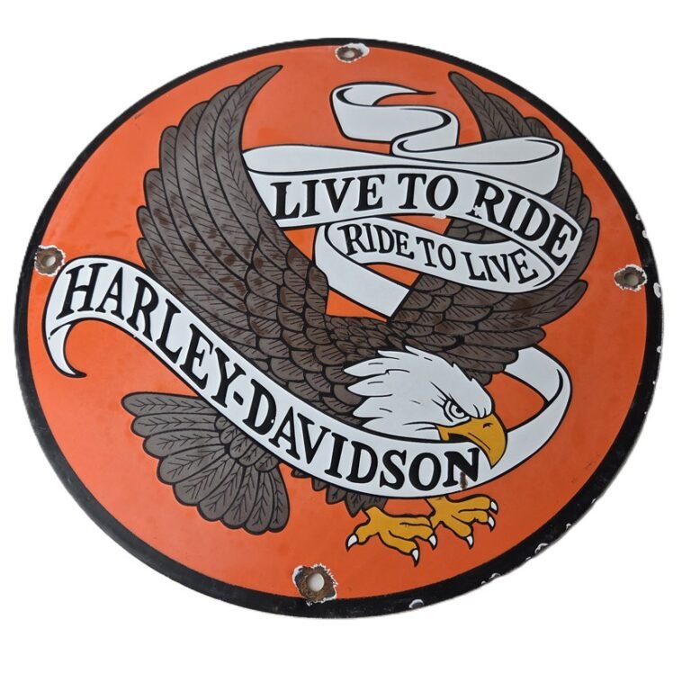
Likewise, the Live to Ride bald eagle porcelain sign brings the eagle onto a bright orange field, 11 3/4 inches across. It fits right next to the Number One.
More Harley-Davidson porcelain signs for the garage
If you want the shield itself, the Aermacchi Harley-Davidson Bar and Shield porcelain sign recalls 1960, when Harley bought into the Italian maker Aermacchi to build smaller bikes. For a shop look, the Widman Motorcycle Repair porcelain sign is a long red bar sign from a St. Louis repair shop. Even boat people get one: the Mercury Outboard Harley-Davidson dealer sign. To see the rest, browse our Harley-Davidson signs, all motorcycle signs and garage signs. When it is time to put one up, our guide on how to hang porcelain signs covers drywall, brick and garage studs.
We ship from Houston, Texas. US orders ship for a flat $10, and international shipping is available at checkout. If a sign is not right, you have 30 days to return it. We pay the return shipping, and you get a full refund.
Harley-Davidson, the Bar & Shield, H.O.G. and the other names in this post are trademarks of their owners. This article is history and commentary only. We sell porcelain advertising signs that celebrate these brands, and we are not affiliated with Harley-Davidson or any other company named here.
FAQ: Harley-Davidson logo history
When was the Harley-Davidson Bar & Shield logo created?
The company’s archives date it to 1910. A 1930 trademark filing says it had been in continuous use since May 6, 1910, and the earliest archive example is the back cover of the 1910 catalog.
Who designed the Harley-Davidson logo?
Nobody knows. The Harley-Davidson Archives say there are no records of who designed it or what inspired it.
Why is the Harley-Davidson logo orange and black?
The archives first link the two colors to the logo around 1922, on parts and accessories packaging such as orange oil cans with black lettering.
Did Harley-Davidson ever stop using the Bar & Shield?
Yes. From 1964 the company used a simplified “diamond logo,” and later the Number One logo. The modern Bar & Shield returned for the Bicentennial, first on the 1977 XLCR.
The featured photo is “Sergt. Rainey,” National Photo Company Collection, 1922, from the Library of Congress, with no known restrictions on publication (public domain). You can see the full photo on Wikimedia Commons.


Add a review
Your email address will not be published. Required fields are marked *